2019 marks the centenary of the Bauhaus, which, during its short existence, became one of the most influential art institutions in Europe. Its active members constituted an international network that included architects and artists from several countries in Central Europe, among them the former Czechoslovakia. The Czech and Slovak connections to the Bauhaus can be studied from various perspectives, and this essay focuses on the role of print periodicals in this history. Here, Sonia de Puineuf highlights some of the Czech and Slovak magazines published between the two world wars and considers how they promoted and disseminated Bauhaus ideas and aesthetics.
The Magazine as a Source of Information
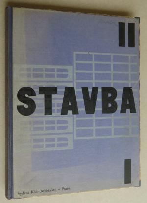
The primary role of a magazine, in particular a special interest magazine, is to keep its readers up-to-date on news that is relevant to their field of interest. One such publication, the architecture-focused magazine Stavba, which the Klub architektů (Club of Architects) began publishing in 1922, was instrumental in bringing information about the Bauhaus to modern architectural circles in Prague. First mention of the Bauhaus in Stavba dates from the magazine’s second year, when the school is mentioned in articles written by Adolf Behne, a German architect and theorist. In his first contribution, Behne gives a short overview of modern post-expressionist architecture in his own country, in which he stresses the name of Walter Gropius and Gropius’s role as founder of the “Staatliches Bauhaus” in Weimar. A few months later, Behne reported in Stavba on the exhibition of international architecture organized by the Bauhaus in the fall of 1923. In this article, he deems the school interesting and rich but criticizes “the praise for straight line and right angle” that he had observed in the majority of its exhibited projects.1Adolf Behne, “Internacionální výstava architektury ve Výmaru (Staatliches Bauhuas),” Stavba 2, no. 6 (1923–24): 108.
Both of Behne’s articles were written specifically for Stavba and translated by Karel Teige, a Czech graphic designer and architectural theorist who subsequently became the leading Czech expert on the Bauhaus. Indeed, Teige, who was in direct contact with Gropius and later on with the Swiss architect Hannes Meyer (and who would go on to give a series of lectures at the Bauhaus in March 1930), wrote regularly on the Bauhaus for Stavba between 1924 and 1930 and dedicated one special issue of ReD—the art magazine that he founded, edited, and designed and that was published by members of the Czech avant-garde art collective Devětsil—to the school in 1930.
Teige’s opinion of the Bauhaus was not initially enthusiastic. In his first article, he draws into question aspects of its pedagogy in particular. Considering the Bauhaus in the historical context of modern art and architecture schools, he suggests that the Bauhaus is “not a model school” because it values craft, a feature associated with traditional nineteenth-century schools of fine and applied arts. Moreover, he comments, “Nowadays the art school of any kind, even the best, is a nonsensical anachronism.”2Karel Teige, “Výmarský Bauhaus a německá moderna,” Stavba 2, no. 12 (1923–24): 200. He accuses Gropius of indecisiveness concerning the teaching of the systematic use of the machine in production (whereby industrial process replaces artisanal manufacture) and asserts that the right “architectural school has to be a scientific school” and to move away from purely formal artistic concerns. In Teige’s argument, the notion of “standard” is the ideal.
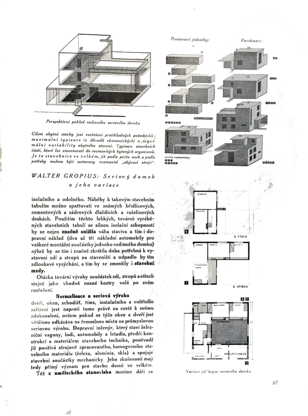
Five months after Teige’s article appeared, Stavba published one by Gropius. In this text, which is based on the Bauhaus director’s lectures in Prague and Brno in December 1924, Gropius discusses machine-made housing and makes an impressive mea culpa in explaining the lack of audacity in his earlier projects.3Walter Gropius, “Stavebnice ve velkém. Strojově vyrábené obytné domy. Jak chceme v budoucnosti stavěti?,” Stavba 3, no. 5 (1924–25): 89. Interestingly, its publication coincided with a radical switch in Teige’s opinion of the Bauhaus: two months later, Teige wrote that Gropius managed to progressively transform the Bauhaus into “a united and model school of architecture, working in a true modern way, like any other school in Europe.”4Karel Teige, “Osud výmarského Bauhausu,” Stavba 3, no. 7 (1924–25): 130. In this same article, he expresses indignation at the closure of the school in Weimar at the very moment it had abandoned “arts and crafts relics.”
In later issues, Stavba announces the school’s move to Dessau,5B. [possibly Adolf Behne or Bedřich Václavek], “Bauhaus v Desavě,” Stavba 4, no. 9 (1925–26): 148. and its new structure is noted by Bedřich Václavek, another important member of Devětsil, who was settled in Brno.6Bedřich Václavek, “Nová činnost Bauhausu v Desavě,” Stavba 5, no. 4 (1926–27): 61–62. Finally, Teige describes the new buildings that Gropius had designed for the school, having seen pictures of them in an article in the magazine Bauhaus (which is mentioned in Stavba among other recommended readings).7Karel Teige, “Deset let Bauhausu,” Stavba 8, no. 10 (1929–30): 146–52.
Through this series of articles published between 1924 and 1928, the Bauhaus entered the international network conscientiously constructed by the Czech avant-garde during the 1920s. The circulation of the magazine’s issues facilitated the exchange of articles and images that in turn disseminated a new conception of life in the modern world—a conception infused with the political commitment of avant-garde artists and architects, who couldn’t imagine their everyday practices as disconnected from the social preoccupations of their time.
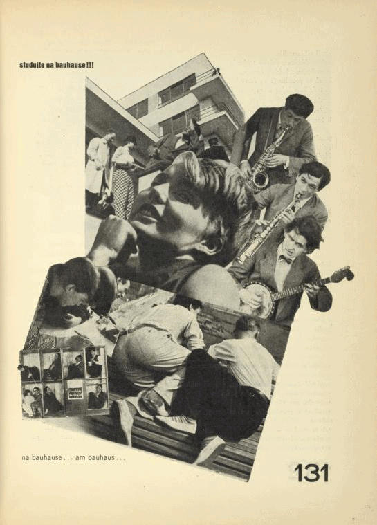
After a two-year period of silence on the Bauhaus in Stavba, which had in the meantime changed its director, Teige published his famous study “Ten Years of the Bauhaus.”8Karel Teige, “Deset let Bauhausu,” Stavba 8, no. 10 (1929–30): 146–52. In this article, he summarizes the history of the school from its first late-expressionist years, through its evolution, the result of fruitful contacts with Netherlandish and Soviet avant-gardes, to its recent functionalist achievements. He expresses his satisfaction with the orientation of the school under the direction of Hannes Meyer, whose philosophy of architecture—which was less about formal composition and more about social concerns—was similar to that of Czech modernist circles. Indeed, Teige writes that the Bauhaus, which had produced “the bauhausstil [Bauhaus style], a modernist manner and fashion,” had been in need of a “revision.” Just such a shift was accomplished through the appointment of Meyer. As Meyer wrote in ReD that same year, the Bauhaus as a “High School of Creation” was “not an artistic but [rather] a social phenomenon.”9Hannes Meyer, “Bauhaus a společnost,” ReD, no. 5 (1930): 130. In highlighting its creative and friendly atmosphere, and conveying the impression of the school as a happy place for people seeking to change society, Stavba and ReD played a role in drawing young people from Czechoslovakia to it.10There were students such as Irena Blühová, who was drawn to the Bauhaus by advertisements for and articles about the school in ReD.


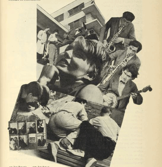
Further, as depicted in these magazine presentations of the 1930s, the Bauhaus was to be understood as the model of a modern-life laboratory that, though structured around architecture, also influenced design. This was illustrated through objects shown in an important Bauhaus exhibition organized in Dessau, which Teige reproduced in an article for Stavba. This piece introduced the magazine’s readership to the look of furniture designed at the Bauhaus as well as to the special layout devised by the German school to display its products and communicate its theories. This means of presentation was reflected in Teige’s design for a special Bauhaus issue of ReD, which had, relative to Stavba, a much more “Bauhaus-style” look, discussed below.
Magazine as Artistic Item
The Bauhaus approach to graphic design had also been under discussion since 1925 in the pages of Pásmo,11See, for instance, László Moholy-Nagy, “Typophoto,” Pásmo 2, no. 1 (1925): 16; published the same year in German in László Moholy-Nagy, Malerei Photographie Film, Bauhuasbücher 8 (Munich: Albert Langen, 1925); and Artuš Černík, “Nová Typografie,” Pásmo 2, no. 2 (1925): 34. ReD, and Typografia,12See, for example, Karel Teige, “O moderní typo,” Typografia, nos. 7–9 (1927): 189–98. and thus Czech graphic designers were aware of the radical changes inspired by the New Typography movement, which brought together Jan Tschichold, El Lissitzky, Kurt Schwitters, and Piet Zwart, among others. Advocating for extreme formal purity in graphic and information design, Bauhaus teachers were involved in the reform of typography, setting up a typographical standard characterized by sans-serif fonts and the suppression of capital letters. At the same time, to express the modern spirit of the Machine Age, they promoted use of elementary geometrical figures in place of ornamental ones, which had been banished (as they had been already in architecture, thanks to Adolf Loos); photography as a typographical shortcut (or “typophoto,” as László Moholy-Nagy named it13See, for example, Roxane Jubert, “Typophoto. Une mutation majeure dans la communication visuelle,” in Photo/Graphisme (Paris: éditions du Jeu de Paume, 2008), 13–28. See also, Pepper Stetler, “‘The New Visual Literature’: László Moholy-Nagy’s Painting, Photography, Film,” Grey Room 32 (Summer 2008): 88–113; Michael Cowan, “Advertising, Rhythm, and the Filmic Avant-Garde in Weimar: Guido Seeber and Julius Pinschewer’s Kipho Film,” October 131 (Winter 2010): 23–50; Andreas Haus, Moholy-Nagy: Photographs and Photograms, trans. Frederic Samson (New York: Pantheon Books, 1980); and Frederic J. Schwartz, “The Eye of the Experiment: Walter Benjamin and the Avant-Garde,” Art History 24, no. 3 (June 2001): 401–44.); and the standardization of paper size by DIN (Standards Association of German Industry14Walter Porstmann, Die DIN-Formate und ihre Einführung in die Praxis (Berlin: Selbstverlag Dinorm, 1923). Walter Porstmann was the DIN employee who developed the A format, which is still in use today, especially in Europe. He also advocated for writing and spelling reforms to the German language.). To sum up: maximal objectivity replaced subjectivity. At the Bauhaus, Herbert Bayer designed the “universal” type that Teige commented upon (and suggested modifications to) in ReD.15See ReD, no. 8 (1929), in which Teige proposes modifying some letters of Bayers’s alphabet, namely a, g, k and x. These new standards revolutionized the design of printed matter—and formed a modern vocabulary that inspired the popular term “Bauhaus style.” Ultimately, however, this categorization was looked down upon by proponents of the Bauhaus once it was adopted by those they believed didn’t understand the social and political commitments of the international avant-garde behind it.16While in 1928, Jan Tschichold illustrated this new typographical style in his book Die Neue Typographie, his treatise on book and graphic design in the Machine Age, by 1929, Hannes Meyer deplored that “all the ladies at the cocktail parties“ have “their calling cards . . . in lowercase letters.” In 1933, Herbert Bayer explicitly made a distinction between the typography taught at the Bauhaus and the so-called Bauhaus-style typography that was but a poor imitation. Herbert Bayer, “graphiker herbert bayer vom studio Dorland in berlin”, typo, 1933, Heft 3: no pagination.
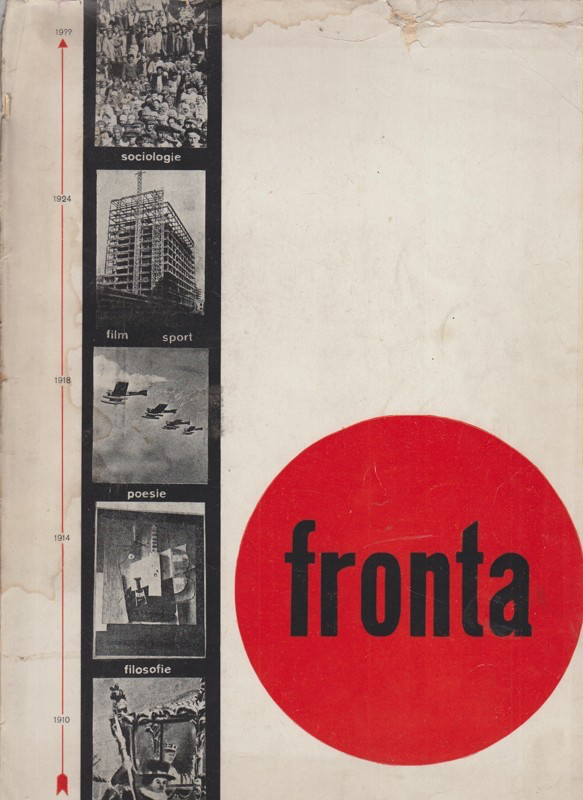
This evolution in modern graphic design directly impacted the formal appearance of avant-garde magazines—as is clear in the Czechoslovak context when comparing Disk, Život, or Pásmo (which are laid out in a playful, post-Dadaist and early Constructivist manner, or at least, reflect a lack of graphic homogeneity)17Život, published in Prague in 1922, was intended as an “almanac of new beauty”; Disk, also published in Prague, had only two issues (1923 and 1925); and finally, Pásmo was a more regular magazine that, rich in content, had several issues published in 1924–26 (the first year in Brno, and the second year in Prague). with magazines published in the second half of the 1920s and early 1930s (which display perfect functionalist discipline). Indeed, in examining fronta, the almanac published in Brno in 1927, one can see how the bridge from artistic amateurism to typographical professionalism was crossed. Designed by Zdeněk Rossmann, who would later study briefly at the Bauhaus, fronta reflects an advanced understanding of the Bauhaus principles of graphic design. The cover possesses some similarities to the Bauhausbücher series (designed by Moholy-Nagy), which was a real inspiration for Rossmann’s own typographical practice. In a radical manner, Rossmann opted for the exclusive use of lowercase letters, not only on the cover of the almanac but also inside, and in this sense, fronta evokes the Bauhaus magazine bauhaus.
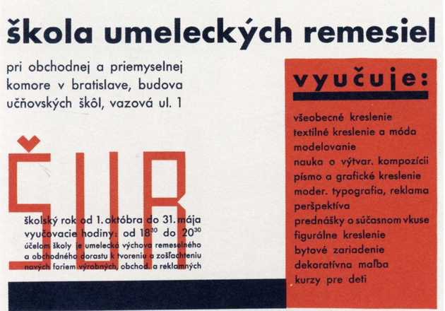
Rossmann was one of the most active users of lowercase letters as is evident in the design of his numerous book covers and the various other ephemera that he created during his Slovak period, in particular. In 1931, after a short semester spent at the Bauhaus, Rossmann was appointed head of the graphic design department at the School of Applied Arts in Bratislava (ŠUR), which was founded in 1928. He was also put in charge of designing the school’s official documents, and thus for promoting its image in a clear, modern way that was naturally close to Bauhaus aesthetics, whose graphic ideal he shared. As an ambitious young man who spoke several languages and was part of a strong international network, his reputation grew quickly in the small Slovak metropole, and he was solicited for many projects. Soon after arriving in Bratislava, he was involved in the publication of a new modern magazine called Nová Bratislava (New Bratislava).
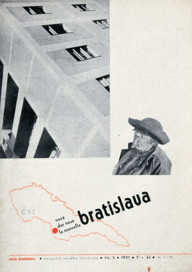
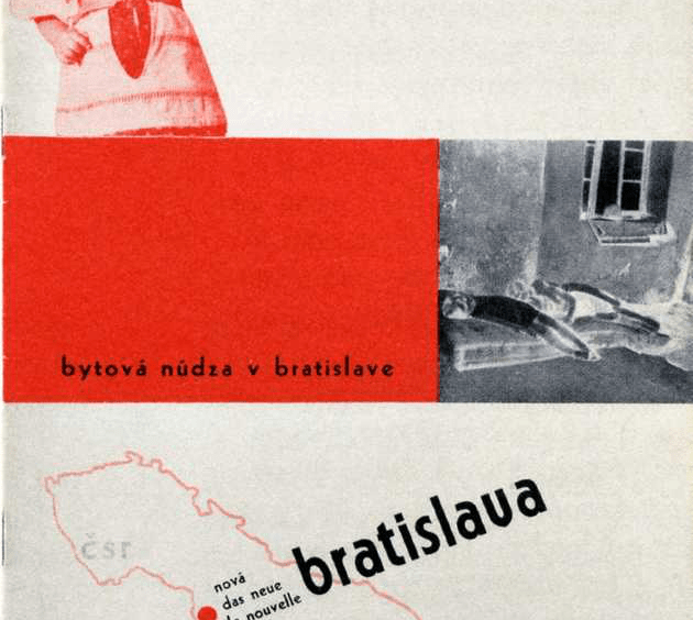
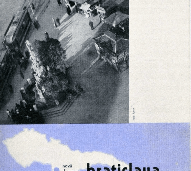
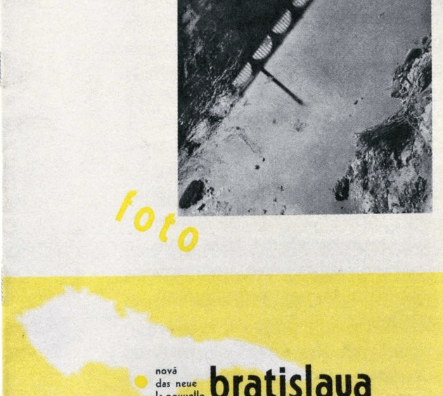
Nová Bratislava was published over five months in 1931–32. Its editor in chief was Daniel Okáli, a Slovak writer and left-oriented literary critic also involved in the publishing of the magazine DAV, which had paved the way for a modernist style in Slovak literature and art during the 1920s.18DAV was founded in 1924 and published, with short interruptions, until 1937. It is considered the first avant-garde magazine with Slovak context. Its tone is engaging, and its first goal was to define the true Slovak character in literature and art. See Sonia de Puineuf, “Les revues de l’avant-garde slovaque et la question de l’identité nationale,” in Revues modernistes. Revues engagées, 1909–1939, eds. Hélène Aji, Céline Mansati, and Benoît Tadié (Rennes: PUR, 2011), 51–60. Another important figure in the undertaking was Antonín Hořejš, a versatile, intellectual Czech connoisseur of music and applied arts, who was closely associated with the foundation of the ŠUR. The editorial circle was completed by Rossmann and the Slovak architect Friedrich Weinwurm.
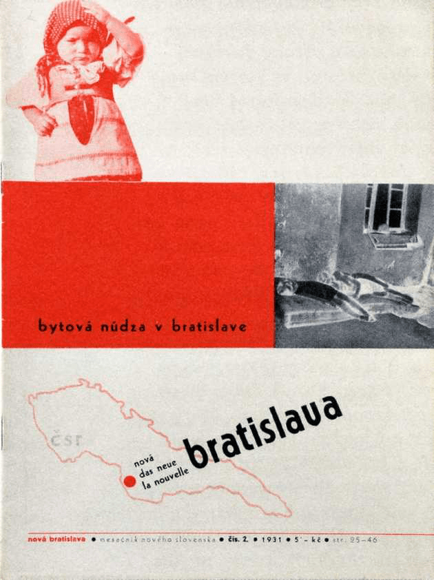
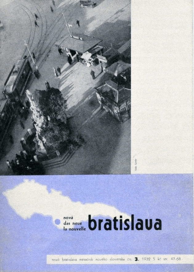
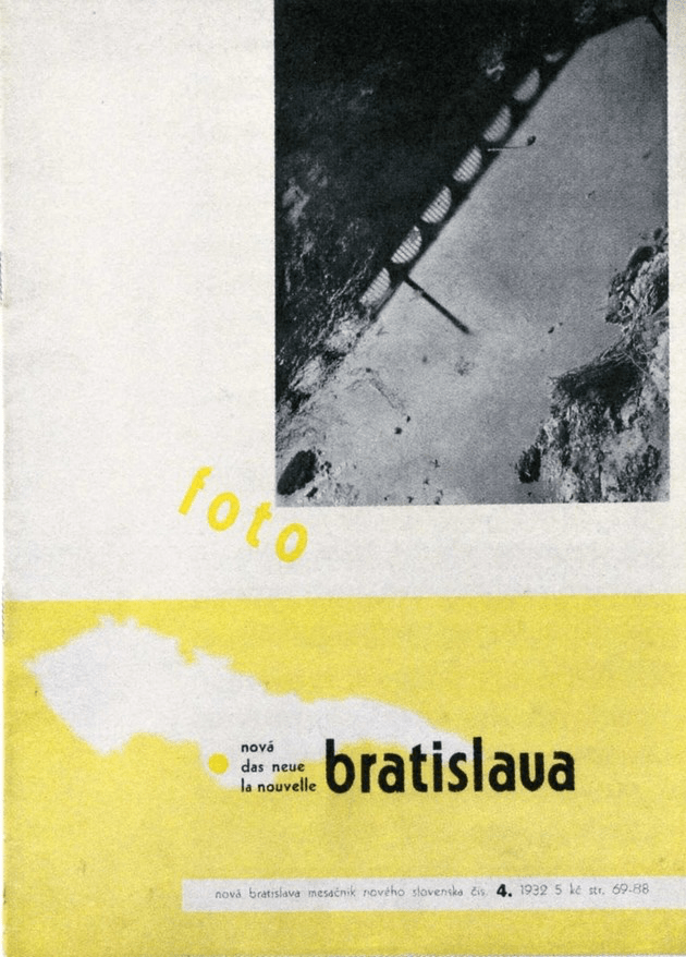
All four issues of the magazine were designed by Rossmann following precise guidelines: They were printed on A4 size paper (the new DIN standard adopted from Germany), with the text structured in two columns and the cover respecting a rigid grid. At the bottom of the cover, Rossmann placed the outline of a map of Czechoslovakia that included a dot showing the location of Bratislava and the title of the magazine written in lowercase letters in three languages (Slovak, German, French).19For more on the layout of this magazine, see Sonia de Puineuf, “A Dot on the Map: Some Remarks on the Magazine Nová Bratislava,” Journal of Modern Periodical Studies 1, no. 1 (2010): 100–111. At the top, he left space for photographic illustrations. The pictures used were mainly taken by Jaromír Funke, a pioneer of Czech avant-garde photography, who settled in Bratislava because he obtained a teacher position at the ŠUR.
The title of the magazine Nová Bratislava suggests a link with the reputed German Das Neue Frankfurt (New Frankfurt). The Slovak magazine aimed to be the“monthly magazine for the new Slovakia,” by covering the look and the role of modern architecture and urbanism from a social perspective in addition to providing overviews of contemporary literature, art, and music. Indeed, Bratislava—a growing city—was considered an urban laboratory in terms of developing an image of modern Slovakia. Even if no mention of the Bauhaus appears explicitly in the magazine, its formal appearance was definitely influenced by the New Typography’s precepts as developed in the 1920s—and its spirit is close to Hannes Meyer’s in terms of conveying the necessary connections between one’s art and one’s sociopolitical convictions.20Slovak and Czech avant-garde artists were highly committed to sociopolitical life, and they could not imagine this conviction as disconnected from artistic practice. Rossmann admired Meyer, and the magazine gave him the opportunity to express this through a short article on the German political situation, which, written in a satiric vein, ends: “The crisis doesn’t exist! Long live Richard Wagner! Long live Niebelungen! Long live Kaiser and the Reich!”21Hannes Meyer, “Bayreuth,” Nová Bratislava, no. 4 (March 1932): 79.
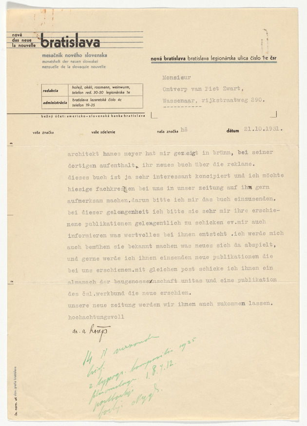
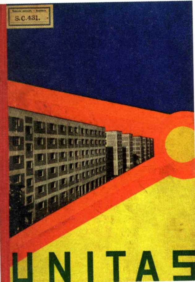
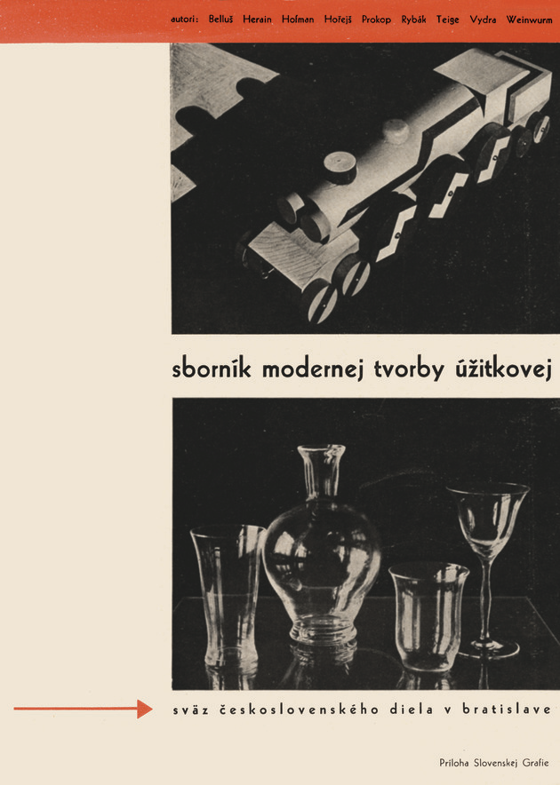
Above all, Nová Bratislava was an efficient tool in terms of enabling Slovak artists to be in contact with foreign protagonists of the avant-garde movement, as shown by a letter from Antonín Hořejš to the Dutch designer Piet Zwart, now in the collection of MoMA’s Architecture and Design Department. In this missive, written on pure functionalist letterhead designed specially by Rossmann for the magazine, Hořejš asks Zwart to send him his new book about advertising—probably the 1931 brochure R(eclame), which Meyer had shown him in Brno. He also suggests that Zwart stay in touch with the magazine and requests additional information about his work. In exchange, Hořejš promises to inform Zwart about events in Slovakia and sends him an issue of the Almanac of the Cooperative Unitas (1931)—a colorful publication highlighting the new functionalist buildings constructed by his editorial colleague Friedrich Weinwurm in Bratislava, as well as a booklet summarizing new Czechoslovak design productions. Through this exchange, Hořejš hoped not only to obtain interesting visual material for Nová Bratislava but also to promote Slovak avant-garde productions abroad.
Indeed, the magazine Nová Bratislava was essential within the context of the Slovak avant-garde scene. The Slovak avant-garde movement was structured around the school ŠUR, where contributors to the magazine taught and which was sometimes referred to as the “Slovak Bauhaus.”
This nickname originated in an article that, written by Josef Rybák, a Czech avant-garde graphic designer and art critic, in February 1931 for the magazine DAV, is entitled “The Bauhaus of Bratislava.”22Josef Rybák, “Bratislavský Bauhaus,” DAV, no. 2 (Bratislava, 1931): 11. In this article, Rybák, who was covering the closure of the Bauhaus in Dessau under National-Socialist pressure, appeals for the development of new kinds of schools that would be, like the Bauhaus, “laboratories that are real avant-garde from the point of view of the work and of the spirit.” He asks, “Are there such schools?” and then answers, “In Bratislava, today, before our eyes, there is an attempt to build and organize a school which could give a positive answer to this question.”
Rybák believed that the success of the ŠUR depended on its teachers and he expresses that the prospect of lectures by Tschichold, Moholy-Nagy, and the Czech graphic designer Ladislav Sutnar, which was announced in the program of the school, made him happy. Thus, the parallel between the ŠUR and the Bauhaus was drawn.
However, just four years later, in 1935, the Hungarian art critic Ernst Kállai published the following statement in the magazine Výtvarná Výchova (Artistic Education), whose editor in chief was the artist, ethnographer, and art theorist Josef Vydra, director of ŠUR at the time: “The School is not and does not want to be a copy of the famous Bauhaus, even if since its origins, it has closely observed the Bauhaus story. On the contrary, the Bratislava’s school is of a more vivid kind, because it is more closely linked with industry and production than the Bauhaus ever was.”23Ernst Kállai, “Škola umeleckých remesiel v Bratislave,” Výtvarná Výchova, no. 3 (Bratislava, 1935): 9.
The controversy of “the Slovak Bauhaus” was thus launched and would be continued in the decades that followed. Previous research on the ŠUR has already questioned the accuracy of this nickname, which supposes a strong link with the German school.24Rainer K. Wick, “Prüfstand Bauhaus-Pädagogik. Die Kunstgewerbeschule in Bratislava,” in Bauhaus im Osten. Slowakische und Tschechische Avantgarde, 1928–39, ed. Susanne Anna (Ostfildern: G. Hatje, 1997), 14–31. Often the difference between the two institutions is stressed through comparisons of their pedagogical structures. It has been pointed out, for example, that the Slovak school did not have the same fundamental organization as the Bauhaus because it opened as an evening school for people already engaged in professional life.25Iva Mojžišová, “Škola umeleckých remesiel v Bratislave 1928-38”, Ars, no. 2 (Bratislava, 1969): 7–12. But this changed, and if World War II had not interrupted the activities of the school (which was closed by the extreme-right Slovak State), its leaders would have set up a structure more similar to that of the Bauhaus—as Rossmann had proposed in 1938.26As mentioned in the Protokol konferencie(pedagogical meeting) report dated January 10, 1938, in ŠUR: zápisnice. Konferencie 1928/29-1938/39, Municipal Archives, Bratislava.
The other distinctive trait of the school was its ongoing dialogue with the popular traditions of arts and crafts. Indeed, Slovakia was mainly a rural territory and as such, unlike Germany, did not have a history of high culture. Folklore played an important role in the definition of the Slovak national feeling,27For more on the special context of Slovak national culture in the beginning of the 20th century, see Tomáš Štrauss, Slovenský variant moderny(Bratislava: Pallas, 1992), 18–20. whether expressed through music, dance, clothing, or everyday objects (made of wood or ceramic). Vydra was well placed as director of the school, given his expertise in the history of folklore, and his passion for this rich creative heritage was taken into consideration when educating students in the applied arts. It was reflected in particular and in a very original way in the paintings by Ludovít Fulla, who taught at the school—despite the fact that in his typographical practice, he made use of the radical modern vocabulary, as one can see in his layout for the magazine Slovenská Grafia(Slovak Graphy)28Slovenská Grafia was a professional magazine for typographers, graphic illustrators, and book printers, published in Bratislava in 1929–32 by people associated with Karol Jaroň. Among its contributors were the members of Czech and Slovak modernist circles, including Antonin Hořejš, Zdeněk Rossmann, Josef Vydra, and Bedřich Václavek, among others. and for the special publication Súkromné listy (Private letters),29Súkromné listy was a special publication by the Slovak painters Ludovít Fulla and Mikuláš Galanda, who lived in Slovakia but had met in Prague as students. Súkromné listy was published in three issues. Its only contributors were the two men themselves. In format, it is more of a manifesto in the form of letters addressed to the public than a magazine. which he set up with his friend the painter Mikuláš Galanda, who also taught at the school.
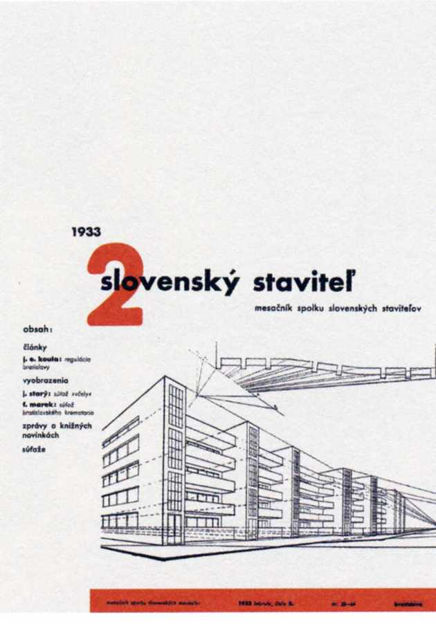
Unlike the Bauhaus, the ŠUR did not have or plan to have an architecture department; however, this lack was somehow compensated for by the strong editorial involvement of the teachers (especially Rossmann) in the sphere of architecture and urbanism, as it can be seen in the magazines Nová Bratislava and Slovenský Stavitel. One might say that they taught architecture vicariously through these magazines, in lieu of in a formal class setting.
One thing is sure: the ŠUR was thought of and used as a tool in the progressive modernization of Slovakia (which included education, urbanization, industrialization, and so on). The word “Bauhaus” evoked the modern-life laboratory and the quest for modernity, if not modernity itself, in the minds of the larger public of that time.
As Frederic J. Schwartz has remarked, “In the popular parlance of the Weimar period, the word ‘Bauhaus’ did not necessarily refer only to the institution itself but to the tendency of which it became emblematic.”30Frederic J. Schwartz, “Utopia for sale,” in Bauhaus Culture: From Weimar to the Cold War, ed. Kathleen James-Chakraborty (Minneapolis and London: University of Minnesota Press, 2006), 116. “Bauhaus” was by that time a modern label, and the original expression “the Bauhaus of Bratislava” (surely more accurate than “the Slovak Bauhaus,” given the Bratislava’s location in the very rural and traditional country that Slovakia was at that time) reflected the unique position of the school within the context of the small Slovak cosmopolite metropole. The ŠUR was capable of attracting modern people from abroad, via the good communication exploring the strong visual identity of the label.
The Magazine as a Tool of Propaganda for Modern Lifestyle
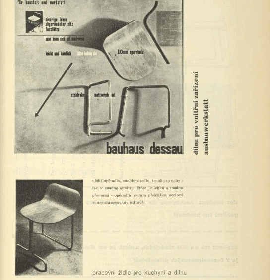
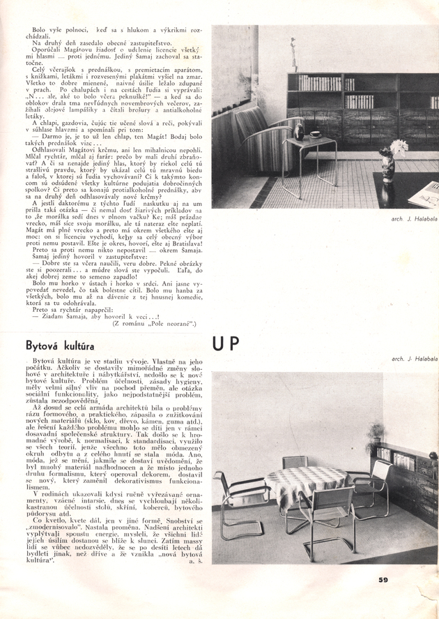
In the history of periodicals, visual identity moves sometimes in a rather unexpected way from purely modernist circles to a wider audience through the mass media. A case in point is that of Nový Svet (New World), an illustrated magazine published in Bratislava from 1926. In the fall of 1930, Hořejš, Rossmann, and the Czech designer Jindřich Halabala edited some articles in which they presented modern furniture designed by Halabala, among others, and produced by the firm Moravian UP. Wardrobes, armchairs, tables, kitchen furniture, lamps, beds, and other domestic objects made in wood and metal were shown in photographs accompanied by a text that explained, in a pedagogical way, the challenges of new types of housing (in particular, small urban apartments). The furniture for such housing, especially in the case of metal objects, was formally inspired by the Bauhaus style, with purity of functional form, hygiene, and order all seen as necessary components of the new lifestyle. All ornamental decoration was banished and historic styles were rejected. The authors suggest that “only the new apartment can be the appropriate environment for a new life and a new education” and claim “the modern apartment as a condition for perfect life.”
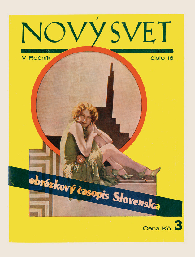
Unlike Nová Bratislava, Nový Svet was not an avant-garde art magazine. It had a much wider readership than the modernist periodical and offered a broader audience for articles on the new “domestic culture” or “culture of living” (equivalent to German “Wohnungskultur”) in Czechoslovakia.31“Wohnungskultur” was the main topic of the magazine Bytová kultura, which was published by Jan Vaněk (director of the Moravian UP furniture factory) in Brno in 1924–25. Clearly, the main aim of these articles was to present the modern design inspired by the Bauhaus products to the larger public, which could not be reached through avant-garde magazines.
In some way, this little avant-garde incursion in the sphere of popular printed periodicals prepared the way for the magazine Nová Bratislava, in which the topic of modern living was capital. However, the more engaged tone of Nová Bratislavamoved the topic from the enthusiastic description of a new kind of lifestyle to more political propaganda for the new human environment. Indeed, in a very surprising way, the same authors who wrote in optimistic terms for Nový Svet expressed pessimistic opinions in Nová Bratislava. For instance, Hořejš judges that the question of the “social functionality” of the new domestic objects remains unanswered. He suggests that the modern movement involved in industrial production and standardization has become “a fashion”—an analysis that brings to mind the ultimate disillusion of the Bauhaus protagonists (especially Meyer). The paper is illustrated with photographs of Halabala’s furniture—which is deemed trendy but likely unaffordable for most.
If one trusts Hořejš’s analysis, it seems that modern architecture and design in Czechoslovakia had a destiny similar to that of Germany. The emerging consumer society adopted the new aesthetics (labeled “Bauhaus style”32In the field of product design, objects in the “Bauhaus style” are considered equivalent to modern functionalist objects designed in a geometric manner and produced in new materials. in Germany) through objects delivered by rationalized industrial production. But the social dimension originally aimed at by the design of such objects was dismissed because of the economic rules of the capitalist market. Nevertheless, three years later, in another issue of Výtvarná Výchova, Kállai gives a more optimistic vision of the Bauhaus legacy, suggesting that “the fertile rays of its [the Bauhaus’s] spirit are still alive.”33Ernst Kállai, “Bauhaus, jeho idea a vývoj,” Výtvarná Výchova, no. 3 (Bratislava, 1935): 14. So, who was right? Did the modern movement fail in its attempt to transform the society or was the spirit of the Bauhaus still alive in the 1930s?
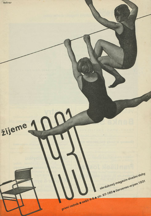
In fact, in interwar Czechoslovakia, the success of functionalism was a reality. During the 1930s, members of the middle class progressively adopted this aesthetic as “their natural lifestyle,”34Iva Janáková, “Managing Krásná jizba,” in Ladislav Sutnar: Prague–New York; Design in Action (Prague: UPM and Argo Publishers, 2003), 115. thanks to the intensive promotion of modern domestic objects in exhibitions and in magazines, not only through advertising (often designed in the Bauhaus style) but also through editorial commentary. There were several factories and firms that spread the modern lifestyle: among them Sandrik in Slovakia (which produced metal tableware), Moravian UP (Jan Vaněk’s well-known furniture manufacturing company), and the Czech publishing house DP (Družstevní práce, or Cooperative Work, with its arts and crafts branch Krásná Jizba). DP was a successful venture by Ladislav Sutnar, the Czech designer who, in traveling to Germany, discovered the power of a good marketing plan, which included the “right promotion[al] and information campaign.”35Ibid. He promoted the line Krásná Jizba (Beautiful Room) through magazines such as Žijeme (We live), which was published by DP. Subtitled an “Illustrated Magazine of Today’s Era,” it reported in a panoramic but homogenous way on the various aspects of the modern lifestyle, which included the important question of artistic education. Edited by designers, architects, and art critics (including Hořejš, Sutnar, Janák, and the Czech architect Bohuslav Fuchs), it was well designed in all aspects of the word and was successful in reaching the broad middle-class readership.
In conclusion, the Bauhaus culture inspired the Czechoslovak design scene through various kinds of magazines in complementary ways. People with some knowledge of the Bauhaus reported on its teaching methods, on its evolution, and on the work of its protagonists in professional publications (such as in Stavba). They adopted the Bauhaus philosophy in their own work and promoted their own social and political concerns in engaged avant-garde magazines designed in a Bauhaus-inspired style (such as fronta, ReD, and Nová Bratislava), and finally, they spread the idea of a new lifestyle inherited from the Bauhaus experience through more popular magazines (like Nový Svet and Žijeme). Even if the word “Bauhaus” was not always pronounced, the visual identity of this label, which was constructed by collective efforts and adopted by the Czechoslovak milieu, was strong enough to attract people who desired to live in a modern world.
- 1Adolf Behne, “Internacionální výstava architektury ve Výmaru (Staatliches Bauhuas),” Stavba 2, no. 6 (1923–24): 108.
- 2Karel Teige, “Výmarský Bauhaus a německá moderna,” Stavba 2, no. 12 (1923–24): 200.
- 3Walter Gropius, “Stavebnice ve velkém. Strojově vyrábené obytné domy. Jak chceme v budoucnosti stavěti?,” Stavba 3, no. 5 (1924–25): 89.
- 4Karel Teige, “Osud výmarského Bauhausu,” Stavba 3, no. 7 (1924–25): 130.
- 5B. [possibly Adolf Behne or Bedřich Václavek], “Bauhaus v Desavě,” Stavba 4, no. 9 (1925–26): 148.
- 6Bedřich Václavek, “Nová činnost Bauhausu v Desavě,” Stavba 5, no. 4 (1926–27): 61–62.
- 7Karel Teige, “Deset let Bauhausu,” Stavba 8, no. 10 (1929–30): 146–52.
- 8Karel Teige, “Deset let Bauhausu,” Stavba 8, no. 10 (1929–30): 146–52.
- 9Hannes Meyer, “Bauhaus a společnost,” ReD, no. 5 (1930): 130.
- 10There were students such as Irena Blühová, who was drawn to the Bauhaus by advertisements for and articles about the school in ReD.
- 11See, for instance, László Moholy-Nagy, “Typophoto,” Pásmo 2, no. 1 (1925): 16; published the same year in German in László Moholy-Nagy, Malerei Photographie Film, Bauhuasbücher 8 (Munich: Albert Langen, 1925); and Artuš Černík, “Nová Typografie,” Pásmo 2, no. 2 (1925): 34.
- 12See, for example, Karel Teige, “O moderní typo,” Typografia, nos. 7–9 (1927): 189–98.
- 13See, for example, Roxane Jubert, “Typophoto. Une mutation majeure dans la communication visuelle,” in Photo/Graphisme (Paris: éditions du Jeu de Paume, 2008), 13–28. See also, Pepper Stetler, “‘The New Visual Literature’: László Moholy-Nagy’s Painting, Photography, Film,” Grey Room 32 (Summer 2008): 88–113; Michael Cowan, “Advertising, Rhythm, and the Filmic Avant-Garde in Weimar: Guido Seeber and Julius Pinschewer’s Kipho Film,” October 131 (Winter 2010): 23–50; Andreas Haus, Moholy-Nagy: Photographs and Photograms, trans. Frederic Samson (New York: Pantheon Books, 1980); and Frederic J. Schwartz, “The Eye of the Experiment: Walter Benjamin and the Avant-Garde,” Art History 24, no. 3 (June 2001): 401–44.
- 14Walter Porstmann, Die DIN-Formate und ihre Einführung in die Praxis (Berlin: Selbstverlag Dinorm, 1923). Walter Porstmann was the DIN employee who developed the A format, which is still in use today, especially in Europe. He also advocated for writing and spelling reforms to the German language.
- 15See ReD, no. 8 (1929), in which Teige proposes modifying some letters of Bayers’s alphabet, namely a, g, k and x.
- 16While in 1928, Jan Tschichold illustrated this new typographical style in his book Die Neue Typographie, his treatise on book and graphic design in the Machine Age, by 1929, Hannes Meyer deplored that “all the ladies at the cocktail parties“ have “their calling cards . . . in lowercase letters.” In 1933, Herbert Bayer explicitly made a distinction between the typography taught at the Bauhaus and the so-called Bauhaus-style typography that was but a poor imitation. Herbert Bayer, “graphiker herbert bayer vom studio Dorland in berlin”, typo, 1933, Heft 3: no pagination.
- 17Život, published in Prague in 1922, was intended as an “almanac of new beauty”; Disk, also published in Prague, had only two issues (1923 and 1925); and finally, Pásmo was a more regular magazine that, rich in content, had several issues published in 1924–26 (the first year in Brno, and the second year in Prague).
- 18DAV was founded in 1924 and published, with short interruptions, until 1937. It is considered the first avant-garde magazine with Slovak context. Its tone is engaging, and its first goal was to define the true Slovak character in literature and art. See Sonia de Puineuf, “Les revues de l’avant-garde slovaque et la question de l’identité nationale,” in Revues modernistes. Revues engagées, 1909–1939, eds. Hélène Aji, Céline Mansati, and Benoît Tadié (Rennes: PUR, 2011), 51–60.
- 19For more on the layout of this magazine, see Sonia de Puineuf, “A Dot on the Map: Some Remarks on the Magazine Nová Bratislava,” Journal of Modern Periodical Studies 1, no. 1 (2010): 100–111.
- 20Slovak and Czech avant-garde artists were highly committed to sociopolitical life, and they could not imagine this conviction as disconnected from artistic practice.
- 21Hannes Meyer, “Bayreuth,” Nová Bratislava, no. 4 (March 1932): 79.
- 22Josef Rybák, “Bratislavský Bauhaus,” DAV, no. 2 (Bratislava, 1931): 11.
- 23Ernst Kállai, “Škola umeleckých remesiel v Bratislave,” Výtvarná Výchova, no. 3 (Bratislava, 1935): 9.
- 24Rainer K. Wick, “Prüfstand Bauhaus-Pädagogik. Die Kunstgewerbeschule in Bratislava,” in Bauhaus im Osten. Slowakische und Tschechische Avantgarde, 1928–39, ed. Susanne Anna (Ostfildern: G. Hatje, 1997), 14–31.
- 25Iva Mojžišová, “Škola umeleckých remesiel v Bratislave 1928-38”, Ars, no. 2 (Bratislava, 1969): 7–12.
- 26As mentioned in the Protokol konferencie(pedagogical meeting) report dated January 10, 1938, in ŠUR: zápisnice. Konferencie 1928/29-1938/39, Municipal Archives, Bratislava.
- 27For more on the special context of Slovak national culture in the beginning of the 20th century, see Tomáš Štrauss, Slovenský variant moderny(Bratislava: Pallas, 1992), 18–20.
- 28Slovenská Grafia was a professional magazine for typographers, graphic illustrators, and book printers, published in Bratislava in 1929–32 by people associated with Karol Jaroň. Among its contributors were the members of Czech and Slovak modernist circles, including Antonin Hořejš, Zdeněk Rossmann, Josef Vydra, and Bedřich Václavek, among others.
- 29Súkromné listy was a special publication by the Slovak painters Ludovít Fulla and Mikuláš Galanda, who lived in Slovakia but had met in Prague as students. Súkromné listy was published in three issues. Its only contributors were the two men themselves. In format, it is more of a manifesto in the form of letters addressed to the public than a magazine.
- 30Frederic J. Schwartz, “Utopia for sale,” in Bauhaus Culture: From Weimar to the Cold War, ed. Kathleen James-Chakraborty (Minneapolis and London: University of Minnesota Press, 2006), 116.
- 31“Wohnungskultur” was the main topic of the magazine Bytová kultura, which was published by Jan Vaněk (director of the Moravian UP furniture factory) in Brno in 1924–25.
- 32In the field of product design, objects in the “Bauhaus style” are considered equivalent to modern functionalist objects designed in a geometric manner and produced in new materials.
- 33Ernst Kállai, “Bauhaus, jeho idea a vývoj,” Výtvarná Výchova, no. 3 (Bratislava, 1935): 14.
- 34Iva Janáková, “Managing Krásná jizba,” in Ladislav Sutnar: Prague–New York; Design in Action (Prague: UPM and Argo Publishers, 2003), 115.
- 35Ibid.